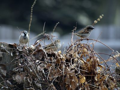
I like this one better - I've lightened the colour balance, although it does seem to flatten the depth in the picture a bit. I like the compositional balance - birds, clematis and fence all seem to be in good space to each other.

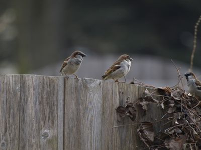
Neil likes this one the best - he likes the profile of the birds and feels that the clematis detracts from the simplicity of the birds. I tried lightening this one, but it seemed to make it too light in some spots. Although the depth of field is better in this one, I feel that the third bird being right on the edge of the photo ruins the compositional balance.

Which one do you like better?
--------------
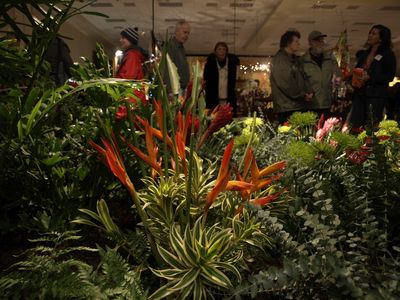
We went to the Stratford Garden Festival on the weekend with my folks. I don't know what everyone else's reasons were - it was very crowded - but I desperately needed a hint of spring.
Usually I can manage to hold out til the Canada Blooms weekend (that's in two weeks) but this year, the yard is a horrible mess and winter seems to be just dragging on.
If we had geothermal energies all over the place like in Iceland, maybe we'd have more recreational greenhouses to get people through winter.
This wild exhuberance of blooms was almost enough.

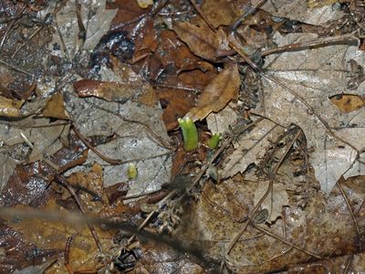
But these darling little things in my own garden the next morning are tipping over my sense of hope. :)

1 comment:
ummm....can you say "Crop"? If you don't like Bird #3, just pare off the edge of the shot.
Actually, I like both picyures, but for different reasons and in different ways.
v
Post a Comment